GittaSitta – Mobile app design
GittaSitta was an app designed to simplify babysitter requests through a trusted personal network. My role focused on creating the branding, UI, and overall user experience to make the process effortless, approachable, and engaging.
Problems & Solutions
Simplifying sitter requests
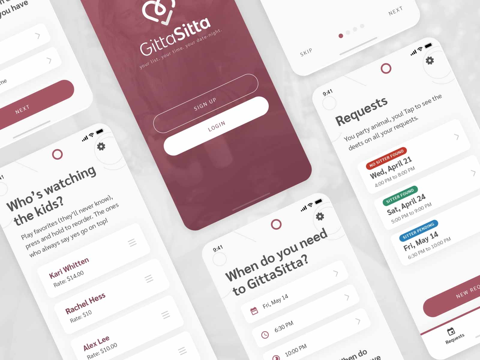
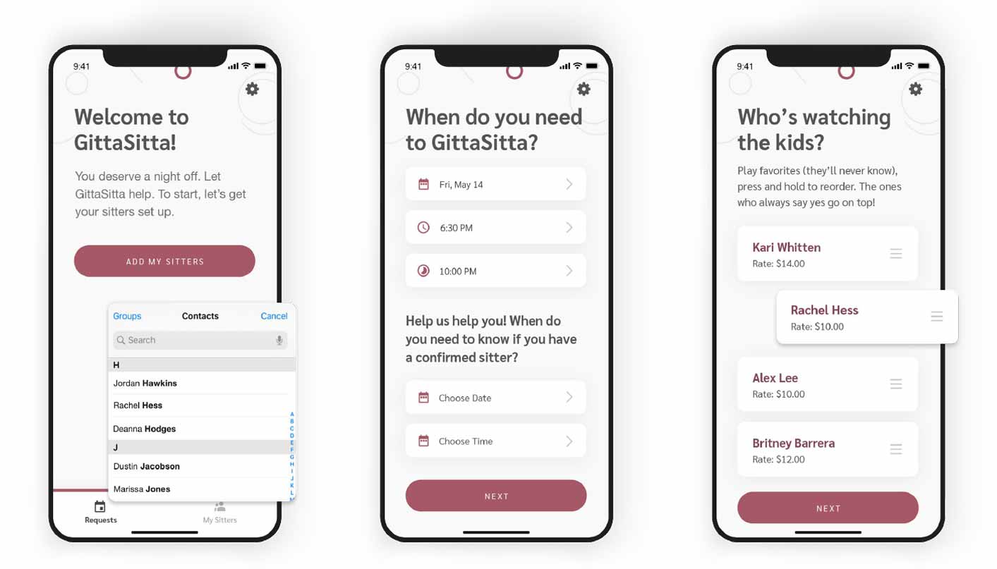
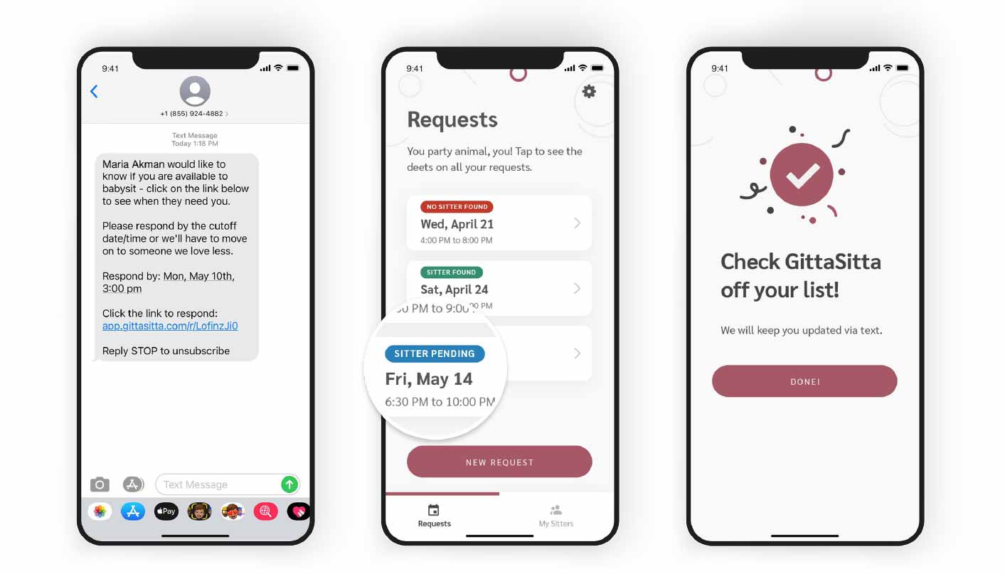
Designed an intuitive, mobile-first interface with ranked sitter lists and automated messaging to reduce friction and make one-handed requests easy.
A clear visual communication
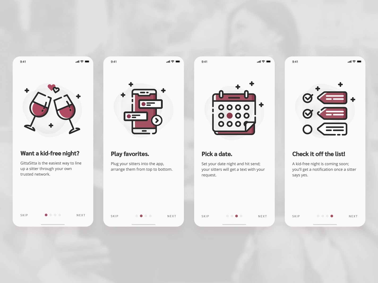
Designed iconography and visual cues to make onboarding, sitter availability, and preferences understandable, reducing cognitive load and guiding users through the app effortlessly.
Embracing a playful brand voice
The stakeholders wanted the app to feel less serious and more fun and snarky, which guided design decisions throughout.
Research & Testing
Market segmentation
GittaSitta's market segmentation targeted 30M U.S. moms and focused on the following demographics:
- Gender: Female
- Age: 28–42
- Family Size: 2+ kids
- Income Level: $70K+
- Behavior: Convenience shopper, tech-savy
Competitive analysis
GittaSitta streamlines the communication with sitters they already know and trust by allowing the user to add all of their sitters into the app, send a single message, and let the app do all the work. Whereas others are ways to source sitters.
- Care.com: GittaSitta utilizes your own trusted network of babysitters, rather than screening strangers to hire.
- Urban Sitter: With GittaSitta, you are tapping your own trusted network vs. sourcing sitters through social media networks.
Customer validation evidence
The usertesting.com platform was used to conduct demo tests with over 60 moms. Users clicked through an online demo of the app, and provided feedback on how the app worked, features they would or would not pay for, and how likely they were to download the app.
Thoughts & Key Takeaways
Designing an app during a pandemic
Changing habits and safety concerns indicated that users were not yet ready for an app like GittaSitta. Despite these challenges, the work still reflected adaptable, thoughtful, and user-focused design decisions.
Designing for inclusivity
Stakeholders initially focused on a very niche audience of moms, but research highlighted that a broader, more inclusive approach would better serve all caregivers.